Beyond Built-In: How Custom Power BI Visuals Fix What Standard Charts Can't
Power BI’s standard visuals are effective for basic reporting but fall short when handling multi-metric comparisons, dense data views, and advanced visual storytelling. We addressed these limitations by designing custom visuals that combine multiple metrics, trends, and context into a single, clear view. By enhancing charts, tables, and KPI cards with embedded visuals, flexible layouts, and better highlighting, we reduced clutter and improved usability. This approach eliminates the need to switch between multiple reports and enables faster, more intuitive decision-making. Overall, the focus shifted from just displaying data to delivering insights in a more meaningful and actionable way.
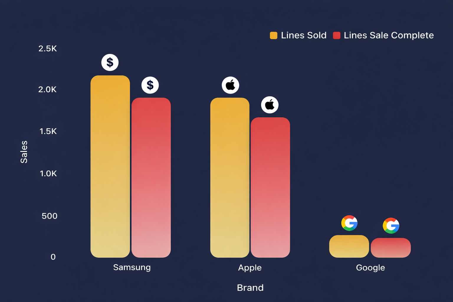
The Chart That Collapsed Under Too Many Metrics:
The problem was that Power BI’s standard visuals could handle simple comparisons like two metrics, but they became cluttered and unreadable when multiple business metrics with different scales were added. This forced users to switch between charts and pages to understand performance, which slowed down decision-making. We solved this by redesigning the visual into a canvas-style layout that brings all key metrics into a single, clear view. Each metric is displayed side by side with its own scale, avoiding distortion and clutter. This eliminated the need for multiple charts and made comparisons instant. As a result, the report became usable and decision friendly.
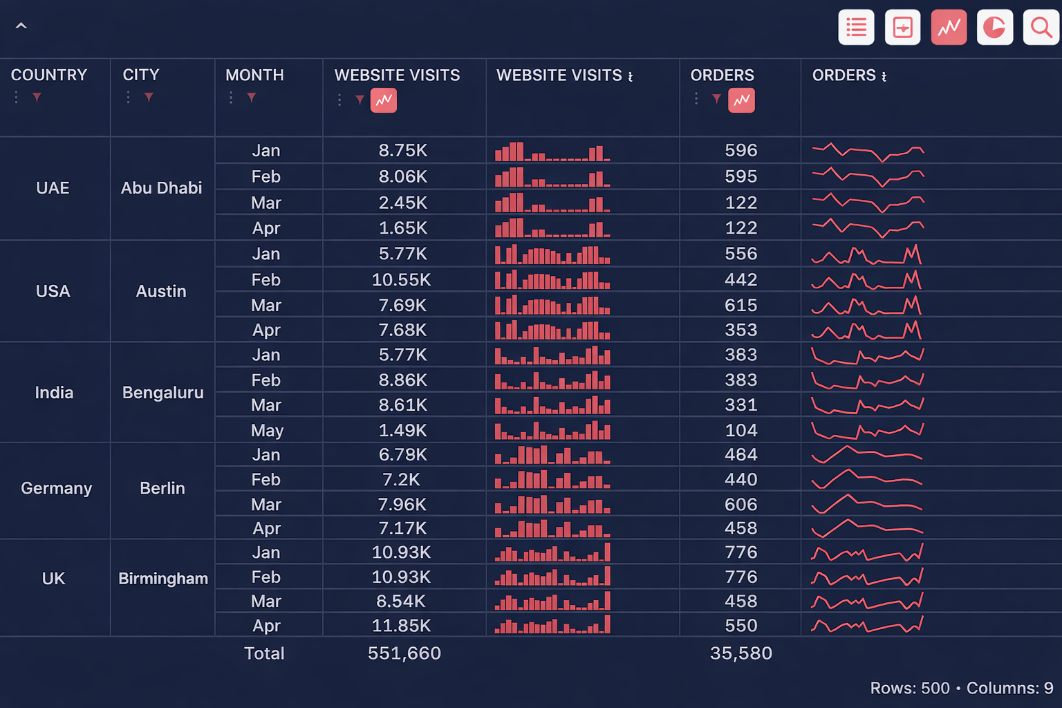
The Operations Table Nobody Could Read
Power BI tables are mostly static and don’t support rich, embedded visuals like detailed sparklines and micro bar charts within each row, which makes it hard to understand trends and patterns alongside the numbers. To solve this, we built an enhanced operations table that integrates mini bar charts for website visits and trend lines for orders directly inside the table cells. This allows users to see both the values and their behavior over time in one place. We also combined multiple metrics and hierarchical data (country, city, month) into a single compact view. In addition, we introduced a search capability that lets users quickly find specific countries, cities, or records within the table. This transformed a static report into a high-density, interactive, and insight-driven operational dashboard.
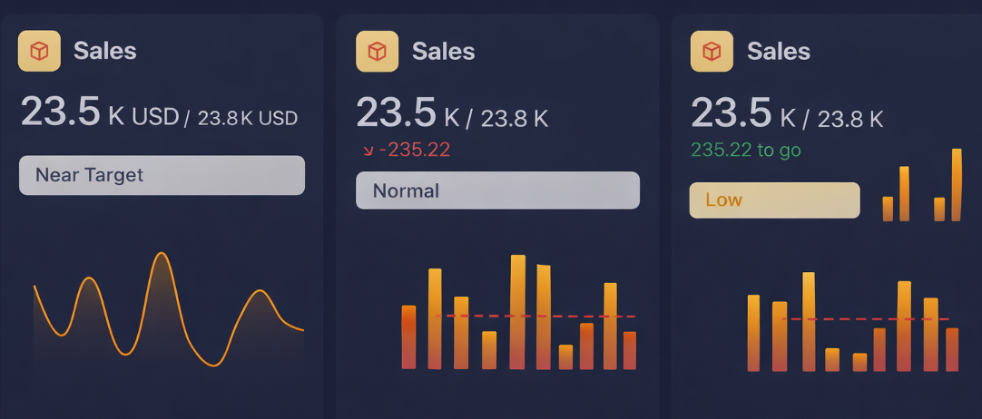
The KPI Card That Couldn't Communicate Status
Power BI standard KPI cards are mostly static and limited to showing a single value with basic indicators, without providing deeper context or trends within the same visual. They don’t effectively combine current value, target comparison, status, and trend behavior in one compact component. To address this, we built enhanced KPI cards that integrate actual vs target values, variance indicators, and status labels like Near Target, Normal, and Low. We also embedded mini trend lines and bar charts directly within the cards to show performance patterns over time. This allows users to understand not just where they stand, but how they got there. As a result, the KPI cards became more contextual, actionable, and decision-focused instead of just displaying numb
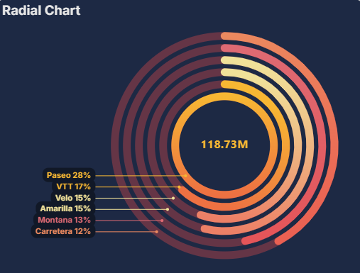
Radial Chart: The Comparison Nobody Could Fit in a Pie Chart
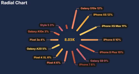
Power BI does not natively support multi-layered radial charts or circular comparisons with multiple categories in a clean and customizable way, especially when you need precise control over layout, spacing, and labeling. Standard visuals like pie or donut charts are limited and quickly become cluttered when handling multiple segments or comparisons. To solve this, we built a custom radial chart that displays multiple categories as concentric or distributed segments, with clear percentage labels and structured spacing. This allows users to compare contributions and distributions in a visually intuitive circular format. We also introduced custom labeling and color gradients to highlight differences and improve readability. As a result, the chart provides a more engaging and insightful way to understand proportional data compared to traditional visuals.
FlexPie: The Pie Chart That Couldn't Drill Down
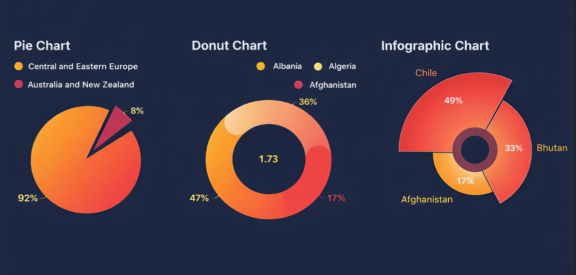
Power BI’s default pie and donut charts are limited in terms of customization, labeling, and storytelling, especially when dealing with multiple categories or when you want to highlight specific segments. They often become cluttered, lack flexible positioning of labels, and don’t support advanced visual styles like exploded views or infographic-style layouts. To address this, we built enhanced versions that allow better control over segment highlighting, custom labels, and percentage display. We also introduced infographic-style layouts and exploded segments to emphasize key categories and improve visual impact. This makes it easier to understand proportions and focus on what matters without overwhelming the user. As a result, the charts became more intuitive, visually engaging, and effective for communication.
The Bottom Line
These five visuals are each built to close a specific gap. If you have hit a similar wall, Get in touch-chances are we have already built what you need.
The data flows into the visual, but it takes time to meet day-to-day needs and adapt as requirements change.